

Showcasing Innovation for Clean Power Alliance
Overview
Overview
Clean Power Alliance (CPA), serving over 3 million residents across Los Angeles and Ventura Counties, needed a website that could effectively communicate their mission of providing sustainable energy choices while making complex information accessible to diverse communities.
Clean Power Alliance (CPA), serving over 3 million residents across Los Angeles and Ventura Counties, needed a website that could effectively communicate their mission of providing sustainable energy choices while making complex information accessible to diverse communities.
The Challenge
The Challenge
The existing website struggled to clearly convey CPA's impact and services to its growing customer base. Key information about sustainability initiatives, community programs, and service options was difficult to find, limiting customer engagement and understanding of clean energy choices.
The existing website struggled to clearly convey CPA's impact and services to its growing customer base. Key information about sustainability initiatives, community programs, and service options was difficult to find, limiting customer engagement and understanding of clean energy choices.
Role
Role
Role
Product Designer
Duration
Duration
Duration
Nov - May 2023
Team
Team
Team


Wireframing
Wireframing
Wireframing helped us solve key structural challenges before diving into visual design. By focusing purely on content hierarchy and user flows, we could test different approaches to organizing content.
Wireframing helped us solve key structural challenges before diving into visual design. By focusing purely on content hierarchy and user flows, we could test different approaches to organizing content.


Data Visualization
Data Visualization
Our data visualization strategy transformed complex energy metrics into intuitive, interactive displays enhanced by smooth animations and engaging design elements. Using a consistent color system, we created dynamic visualizations that animated seamlessly to capture user attention and make data exploration more engaging across all devices.
Our data visualization strategy transformed complex energy metrics into intuitive, interactive displays enhanced by smooth animations and engaging design elements. Using a consistent color system, we created dynamic visualizations that animated seamlessly to capture user attention and make data exploration more engaging across all devices.
Article Pages
Article Pages
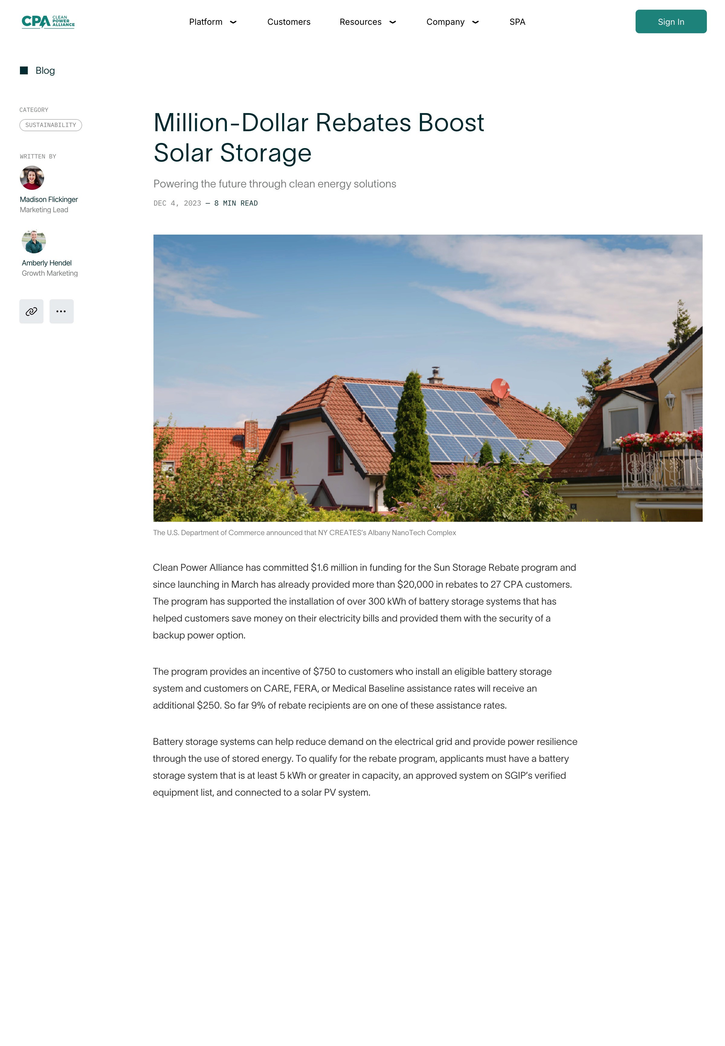
Our article design system established clear typographic hierarchies and interactive tag filtering, allowing users to easily explore news, program updates, and educational content. The responsive layouts adapted seamlessly to different content types while maintaining consistent styling across all article components.
Our article design system established clear typographic hierarchies and interactive tag filtering, allowing users to easily explore news, program updates, and educational content. The responsive layouts adapted seamlessly to different content types while maintaining consistent styling across all article components.


Results
Results
Transformed complex energy information into an intuitive website through clear information architecture and engaging animations
Created a cohesive design system with responsive article layouts and interactive data visualizations
Enhanced data comprehension through dynamic charts and smooth animations that bring energy metrics to life